Market Analysis Dashboard Demo
Insights into the international student traffic and programme supply on Bachelorsportal and Mastersportal between January and December 2020
This dashboard provides a preview of the preferences of over 50 million prospective students who visit our portals annually. The dashboard only shows the preferences of prospective students who visited our portals in 2020. Our internal research shows that it usually takes prospects one to two years to become enrolled students after they begin their research online, thus the students represented in this dashboard are likely enrolled by now. If you are interested in up-to-date insights into prospective students, please get in touch by completing the contact form on our website.
The dashboard is interactive, so we encourage you to hover over different visuals, apply filters, etc. Clicking on any element in the dashboard will filter it for that selection. Additionally, in the left sidebar, there are four filters you can use. All the numbers in the dashboard are recalculated based on your selected filters.
The dashboard shows the visitor patterns for Bachelorsportal and Mastersportal between January and December 2020, based on pageviews and programme supply.
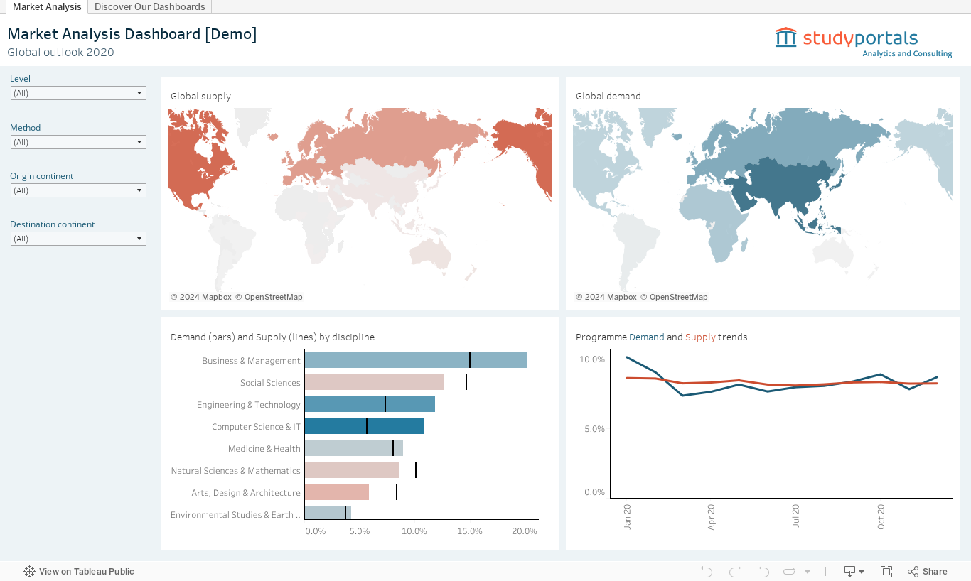
Global supply
The map on the left shows the relative programme supply per continent – the deeper the colour, the higher the relative supply in that continent. If you hover over a specific continent, a tooltip with the top countries by relative supply in that continent will appear. Clicking on a specific continent will filter all other visuals accordingly.
Global demand
The map on the right shows relative programme demand (expressed as pageviews generated by prospective students) per continent – the deeper the colour, the higher the relative demand in that continent. If you hover over a specific continent, a tooltip with top countries by relative demand in that continent will appear. Clicking on a specific continent will filter all other visuals accordingly.
Demand and supply by discipline
The discipline breakdown at the bottom left shows the relative supply of programmes in each discipline (black lines) and the relative demand by the percentage of pageviews (colourful bars) that programmes in these disciplines received. The colours of the bars show how saturated the market for the programmes in every discipline is: the deeper orange the bar is, the more saturated the market (supply exceeds demand) and the deeper blue the bar is, the more nonsaturated the market is (demand exceeds supply).
Programme demand and supply trends
The graph at the bottom right shows how the relative supply (orange line) and demand (blue line) for programmes in the selection have been developing over the year 2019.
Use case scenarios
The Market Analysis Dashboard can help you answer various research questions related to international student recruitment. For example, which subject areas are the most promising for a new programme introduction? What disciplines are the most popular among Asian students? How has the interest in Master’s programmes been developing over time? More detailed insights including absolute numbers, country and city-level data, recent and historic data, etc. are available through our various dashboard modules.