What is Tableau?
Tableau Software Inc. is an American interactive data visualization software company focused on Business Intelligence. We use Tableau to visualize our data and design our dashboards.
How can I access my dashboard?
The dashboards can be accessed by logging into Tableau Cloud with the User License that you will receive from us at the start of your partnership with us.
I forgot my password. What should I do?
How many people can log in at the same time?
Tableau enforces Multi-Factor Authentication (MFA) which is an electronic authentication method in which a user is granted access to the website only after successfully presenting two or more pieces of evidence (or factors) to an authentication mechanism. As such, every user needs his/her own personal user license.
Can I reassign the user license to another person?
Can I give people from other institutions access to my dashboard?
Access to our dashboards is contractually limited strictly to your institution. Sharing access with someone outside of your institution is in direct violation of our Terms & Conditions.
What can I share with people from other institutions?
While you are not allowed to give full access to your dashboards to people outside your institution, you are allowed to share screenshots or the results of your analyses. However, you are not allowed to share any downloaded data without prior approval from Studyportals.
What is Multi-Factor Authentication?
Multi-Factor Authentication (MFA) is a secure account authentication method that requires users to prove their identity by providing two or more pieces of information, also known as “factors”, when they sign in to Tableau Cloud. The first factor is unique information only know to you — your user name and password. Additional factors are verification methods that users have in their possession, such as an authenticator app.
What is Multi-Factor Authentication used for?
Can I choose not to use Multi-Factor Authentication?
Which Multi-Factor Authentication method should I use?
Tableau offers a number of MFA methods:
- Salesforce Authenticator: This option prompts the authenticator app provided by Salesforce.
- One-Time Password Generator (recommended): This option allows you to use any other authenticator app. The most popular are 2Fas, Microsoft Authenticator, Google Authenticator, LastPass.
- Security Key (not recommended): A security key is a small physical token that works as a verification method for MFA logins.
- Built-In Authenticator (recommended only if One-Time Password Generator is not an option): Built-in authenticators (also called platform authenticators) verify a user’s identity through a biometric reader, such as a fingerprint, iris, or facial recognition scanner, which is built into a user’s computer or mobile device. Or in some cases, built-in authenticators can confirm a user via a PIN or password that the user sets up in their device’s operating system. Built-in authenticators are a great option if a mobile app solution isn’t viable.
Considering the above, One-Time Password Generator is the recommended option.
Can I change my verification method?
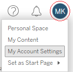
You can manage verification methods from your ‘My Account Settings’ page in Tableau. On this page, you can add or change verification methods.
You can find ‘My Account Settings’ at the top right of your screen within Tableau Cloud by clicking on your profile circle.
What does ‘Method’ mean?
The field ‘Method’ refers to the method of teaching/attendance, specifically whether the programme is taught solely on-campus, online, via a blend of methods or multiple options (e.g., online or on-campus).
What does ‘Country of origin’ mean?
‘Country of origin’ does not mean nationality or even necessarily residence. We can only determine the location based on the users’ IP addresses, which means that we can only track where they are at the moment of using our website. For example, a Chinese exchange student in the US would be counted as a US visitor. Similarly, a German user browsing our website while travelling through the UK, would be counted as a UK visitor. Along the same logic, someone in China using a VPN set to the USA will be counted as coming from the USA.
What does ‘Country of destination’ mean?
‘Country of destination’ is the location where an institution is located.
What are ‘Overlapping sessions’?
In our Competitor Analysis modules, ‘Overlapping Sessions’ refers to the count of instances where a visitor engaged with a competing programme during the same session as they visited the programme under investigation.
What does ‘Pageviews per programme’ mean?
‘Pageviews per programme’ is the sum of pageviews divided by the number of programmes in the group that is being assessed.
Why do the dashboards use pageviews as an indication of demand?
Studyportals ACT deliberately chose to utilize pageviews, rather than individual users, IP addresses, or referrals, as the basis for our data model. This decision is underpinned by several key reasons.
Firstly, within the user journey on our website, pageviews represent the deepest level of engagement that Studyportals can effectively monitor. This metric is less influenced by promotional activities compared to others, such as click-throughs to university websites.
Secondly, tracking individual users is typically reliant on IP addresses. However, this method has limitations, as multiple users may share a single IP address. For instance, in a public library, potentially dozens or hundreds of patrons could be accessing the internet using the same IP address.
Lastly, our dashboards are engineered to analyze market demand. In this context, assessing demand requires considering not just the number of users, but also the intensity of their interest. For example, if user A explores ten business courses and user B looks at one business course and nine medicine courses, their interest levels in business courses are not the same. Therefore, it’s important to weigh their engagement according to the depth of their interest.
What are relative demand, relative supply and market opportunity?
Relative demand is the proportion of pageviews that a specific category garners within a total figure. For instance, UK Master’s programmes received 4.7 million out of the total 26 million pageviews on Mastersportal in 2019, translating to 18% of the global relative demand.
Relative supply, on the other hand, represents the share of programmes offered by a category in comparison to the global total. In 2019, UK institutions offered 19,400 Master’s programmes out of a worldwide total of 82,200, indicating that the UK’s relative supply was 24% of the global Master’s offerings.
Market opportunity is calculated as an index number, comparing relative demand to relative supply. It is obtained by dividing the percentage of pageviews (relative demand) by the percentage of programmes offered (relative supply). A market opportunity index close to 1.0 suggests a balance between demand and supply. An index above 1.0 indicates higher demand than supply, signaling a favourable market for introducing more programmes. Conversely, an index below 1.0 denotes an oversupplied market with more programmes than demand, suggesting less favorable conditions for new offerings. For example, in 2019, the UK Master’s relative demand was 18% against a relative supply of 24%, leading to a market opportunity index of 0.75. This indicates a less favorable position for UK higher education in the global market compared to non-Anglophone countries.
What is Studyportals’ market coverage?
Studyportals has a market coverage of approximately 90% of all English-taught Bachelor’s and Master’s programmes worldwide.
Why is the market opportunity for the UK and US so low?
Studyportals only lists English-taught higher education programmes. In countries like the Netherlands and Germany, only the programmes that are specifically aimed towards international students are taught in English, and therefore stand out in the international programme offering. In Anglophone countries like the UK and the US, every programme is taught in English and there are many more institutions than in other countries, therefore the supply is much bigger and outweighs the demand from international students.
What is the function of the ‘Include Paid Advertising’ filter in our dashboards?
The ‘Include Paid Advertising’ filter allows you to incorporate data on paid traffic in your analyses. When activated, this filter adds information from external marketing campaigns, like Google Ads and remarketing efforts, into your overall traffic analysis. By default, this filter is turned off, ensuring that your initial analysis focuses on organic traffic.
Should I consider including Paid Advertising traffic?
When analyzing student interest in international higher education, including paid advertising gives you a complete view, while excluding marketing-influenced pageviews provides a measure of student interest unaffected by promotions.
What determines the sorting order of data in the charts?
The sorting order of data in our charts is primarily by relative demand (pageviews) in descending order. However, for specific analytical needs, some charts may be sorted by the number of programmes.
Why does recalculating the programme numbers in the ‘Disciplines’ chart to represent 100% give a different total than the ‘Selection sample size’?
This discrepancy arises due to the way programmes are categorized on the Studyportals platform. For instance, consider a scenario where the dashboard shows 200,000 programmes in the “Selection sample size” box. When you examine the ‘Business & Management’ bar in the ‘Disciplines’ chart, it might indicate 45,000 programmes with a 15% relative supply. Recalculating this (45,000 / 15%) to represent the entire 100% gives a figure of 300,000 programmes, which exceeds the number in the ‘Selection sample size.’
The reason behind this difference is that on Studyportals, each programme can be associated with up to three sub-disciplines. Therefore, the percentage shown in the ‘Disciplines’ chart doesn’t represent the proportion of programmes exclusively in ‘Business & Management’; it reflects the proportion of programmes that include ‘Business & Management’ as one of their categories.
This characteristic is specific to the ‘Disciplines’ chart and should not affect your overall findings.
Note: The ‘Disciplines’ chart is available in Market Analysis, City Analysis and Tuition Fee modules.
What should I do if I spot anomalies in my analyses?
It is possible that you might have spotted an interesting trend or a spike, which we would be interested in publishing in a joint press release. It is also possible that you spotted an automated bot that was systematically going through our website or another anomaly influencing the data in an untoward way, in which case we will remove it as soon as possible. Studyportals ACT catches the vast majority of bots but it is possible that on rare occasions some might slip through.
If you see anything in the data that you have questions or comments about, please contact us.
Why is China such a small country of student origin?
You might notice that Chinese visitors represent only a small part of our traffic, although China is the largest source of international students worldwide. Unfortunately, this is a result of China’s restrictive internet policies that also restrict access to Google. Since most of the Studyportals’ traffic comes through organic Google searches, Chinese visitors are underrepresented.
What constitutes a reliable sample size for conducting an analysis?
Naturally, the larger the sample size, the more statistically significant the analysis, but statistically speaking, a sample size of 385 is reflective of a population of any size with a 95% confidence level and a 5% margin of error. However, Studyportals ACT recommends larger sample sizes where possible, preferably over 1,000.
How to export data for reports and presentations?
In any given dashboard there is a button at the top-right corner called “Download”.
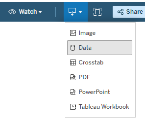
If you click on that, you will see a menu with different download options available to you, based on your contract with us.
- Export Image downloads a screenshot in JPEG format.
- Export Crosstab exports data directly to an Excel document.
- Export PowerPoint or export PDF is effectively the same as Export Image, but the image is exported in a PowerPoint or a PDF file.
When does my data update?
If you have purchased a live feed for your dashboards, the data updates monthly on the second day of every month. The update process starts on the second day of every month at 10:15 AM GMT+1 and may take a few hours.
We regularly monitor dashboard updates, but if you notice that the data has not updated by the third day of the month, please contact us.
Can I request customisations to my dashboards?
Yes, customisations to your dashboards, such as custom filters, views and more, are available at an additional cost. It is also possible to request a completely custom dashboard. To discuss the possibilities, please contact us.
Can I add data from other sources to the dashboard?
It is possible to connect external data to Tableau, such as Excel and CSV files, Google Drive, other databases, some CRM systems and more. For example, you could be interested in adding your own enrolment statistics, visa acceptance rates per country, demographic information and more.
However, whether it is really possible depends on various factors such as the cleanliness of the data, its structure, intellectual property rights and more.
To discuss such customizations and the time and costs involved, please contact us and we can find the right solution and estimate a time investment required from our side.
Can I refresh the data?
Yes, if it applies, the data can be refreshed within Tableau by clicking the button on the menu at the top of your screen:

Note: the data refreshes in the same view and only if the actual dataset that is linked is updated. If there are no changes within the dataset the file will not change.
I have changed some filters, can I reset the original view?
The dashboard offers a straightforward method for reverting to your previously chosen or default view. This can be achieved using the intuitive buttons located in the top menu of your screen.
![]()
- The left arrow button lets you step back to a previously selected view, simultaneously resetting the filters to match that specific view.
- The middle arrow serves as a forward navigation tool, allowing you to revisit the steps you had previously navigated away from, while restoring the filters to their respective states at each step.
- The right arrow is designed for a complete reset, reverting the dashboard to its original layout and reapplying the initial set of filters.
Can I change my Tableau Cloud starting page?
Yes, it is possible to change your Tableau Cloud starting page. To do so, follow these stesp:
- Start by navigating to your preferred starting page.
- Next, click on your account circle in the top-right corner, then click ‘Set as Start Page’ and ‘For Me’:
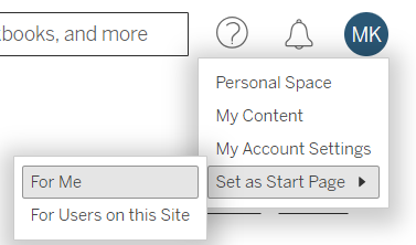
The next time you log in to the Tableau Cloud you will start on the selected page.
Is the dashboard data compliant with GDPR and CCPA rules?
Yes, the data in the dashboards is fully compliant with General Data Protection Regulation (GDPR) and California Consumer Privacy Act (CCPA).
The vast majority of the data in the dashboards is aggregated (i.e., anonymous) and in other cases carefully anonymized or pseudonymized to such an extent that any data leak of the dashboard data would not allow outsiders to identify our website visitors or our registered users.
Who owns the data and the dashboards?
Ownership of Data and Dashboards
- The majority of the data and the dashboards, with a few specific exceptions, are the intellectual property of Studyportals. This means that Studyportals has the exclusive rights to this content.
- The ‘Origin Country Indicators’ dashboard incorporates data from Oxford Economics alongside our data, reflecting a collaborative integration of sources.
- The ‘Global Student Mobility’ dashboard integrates data from UNESCO with our data.
Regulations Governing Data Access
- Due to strict privacy regulations outlined in the General Data Protection Regulation (GDPR) and the California Consumer Privacy Act (CCPA), direct access to our database by external parties is not permissible. These regulations are in place to protect personal data and privacy.
- Consequently, you cannot access the background data or directly edit the dashboards. This restriction is a legal requirement to ensure data protection and privacy compliance.
Implications for Users
- As a user, you can utilize the insights and information presented in the dashboards for analysis and decision-making purposes.
- However, any modification of the dashboards or direct manipulation of the underlying data is not allowed, in order to maintain data integrity and adhere to legal requirements.
For more information, please consult our Terms & Conditions.
What do the colourful bars and black horizontal lines show?
The bars show relative demand and the horizontal black lines show relative supply.
What is the significance of the various bar colors?
The colour of each bar serves as a visual indicator of the current market conditions:
- Red Bar: This color signifies a market where supply exceeds demand. In such a scenario, introducing new programmes might be challenging due to high competition and lower demand.
- Green Bar: A green bar indicates a favorable market condition where demand surpasses supply. This suggests a potential opportunity for successfully launching new programmes.
- Yellow Bar: When you see a yellow bar, it represents a balanced market where supply and demand are evenly matched. This implies a stable but potentially competitive environment for new initiatives.
Can I select multiple countries simultaneously for analysis in the map charts?
Absolutely, the map charts offer flexible selection tools to include multiple countries in your analysis easily. You can use one of the following tools, each tailored for different selection needs:
- Rectangle Tool: Ideal for selecting a group of countries in a rectangular area. Simply click and drag to form a rectangle around the desired countries.
- Radial Tool: This tool allows you to select countries within a circular area. Click and drag to create a radius that encompasses the countries you’re interested in.
- Lasso Tool: Perfect for more precise, free-form selections. Click and drag to draw a custom shape around the specific countries you wish to include.
To access these tools, hover over the map area in our interface. Then, move your cursor over the right-pointing arrow to reveal the tool options, and select the one that best fits your analysis needs.
Why can I only see parent disciplines and not sub-disciplines even though it should be included with my dashboard?
Tableau has an expand/collapse functionality for hierarchies such as discipline to sub-discipline level.
If you cannot see them, this is likely due to this expand/collapse functionality. We often use this functionality to save space in the dashboard, but it can be quite easy to miss.
When you hover over the ‘Disciplines’ chart, to the left you will see a little box with a plus (+) sign. If you click on it, it will expand the hierarchy to a lower level. If you want to collapse it again, hover over a given discipline name and at the top of the figure you will see a little box with a minus (-) sign, which will collapse the chart to a higher level in the hierarchy.
Why does relative student interest still sum up to 100% after I applied filters to the data?
Student interest to study abroad is influenced by a variety of factors, including study levels, destinations, methods, and the specific market being investigated. These interests may also change according to the filters applied, reflecting the diverse needs and goals of students.
When you apply filters, for example, to exclusively analyse student interest in STEM fields for on-campus Bachelor’s and Master’s programmes offered in the US, the UK, Canada, and Australia, the analysis will focus on how interest is distributed within these specific parameters. It’s important to note that while this approach provides insights into student preferences under these conditions, it does not encompass all global student interest.
What do the colourful bars and black horizontal lines show?
The bars show relative demand and the horizontal black lines show relative supply.
What is the significance of the various bar colors?
The colour of each bar serves as a visual indicator of the current market conditions:
- Red Bar: This color signifies a market where supply exceeds demand. In such a scenario, introducing new programmes might be challenging due to high competition and lower demand.
- Green Bar: A green bar indicates a favorable market condition where demand surpasses supply. This suggests a potential opportunity for successfully launching new programmes.
- Yellow Bar: When you see a yellow bar, it represents a balanced market where supply and demand are evenly matched. This implies a stable but potentially competitive environment for new initiatives.
Can I select multiple countries or cities simultaneously for analysis in the map charts?
Absolutely, the map charts offer flexible selection tools to include multiple countries or cities in your analysis easily. You can use one of the following tools, each tailored for different selection needs:
- Rectangle Tool: Ideal for selecting a group of countries in a rectangular area. Simply click and drag to form a rectangle around the desired countries or cities.
- Radial Tool: This tool allows you to select countries or cities within a circular area. Click and drag to create a radius that encompasses the countries or cities you’re interested in.
- Lasso Tool: Perfect for more precise, free-form selections. Click and drag to draw a custom shape around the specific countries or cities you wish to include.
To access these tools, hover over the map area in our interface. Then, move your cursor over the right-pointing arrow to reveal the tool options, and select the one that best fits your analysis needs.
Why can I only see parent disciplines and not sub-disciplines or cities even though it should be included with my dashboard?
Tableau has an expand/collapse functionality for hierarchies such as discipline to sub-discipline or country to city level.
If your dashboard should include sub-disciplines or cities of origin but you cannot see them, this is likely due to this expand/collapse functionality. We often use this functionality to save space in the dashboard, but it can be quite easy to miss.
When you hover over the ‘Disciplines’ or ‘Origins’ charts, to the left you will see a little box with a plus (+) sign. If you click on it, it will expand the hierarchy to a lower level. If you want to collapse it again, hover over a given discipline or continent/country name and at the top of the figure you will see a little box with a minus (-) sign, which will collapse the chart to a higher level in the hierarchy.
Why can I only see origin cities and not destination cities?
Our decision to limit data analysis to origin cities, excluding destination cities, is driven by a commitment to uphold our clients’ privacy. Specifically, when data is broken down to the level of destination cities, there’s a potential risk of exposing sensitive information. This is particularly pertinent in cases where a university is the sole institution in a destination city. By restricting the analysis to origin cities, we ensure a balance between providing valuable insights and maintaining the confidentiality of our clients’ information.
Why does relative student interest still sum up to 100% after I applied filters to the data?
Student interest to study abroad is influenced by a variety of factors, including study levels, destinations, methods, and the specific market being investigated. These interests may also change according to the filters applied, reflecting the diverse needs and goals of students.
When you apply filters, for example, to exclusively analyse student interest in STEM fields for on-campus Bachelor’s and Master’s programmes offered in the US, the UK, Canada, and Australia, the analysis will focus on how interest is distributed within these specific parameters. It’s important to note that while this approach provides insights into student preferences under these conditions, it does not encompass all global student interest.
What are ‘Great Match’ countries in the quadrant analysis?
In quadrant analysis, ‘Great Match’ countries are identified based on two key criteria related to the study of a specific (sub)discipline. These criteria are:
- Above average interest in the (sub)discipline: These countries exhibit a higher-than-average level of interest in studying the particular (sub)discipline being analyzed. This means that a significant number of students in these countries are keenly interested in this field of study.
- Above average interest in studying the (sub)discipline in the country under scrutiny: Additionally, there is an above average interest from these countries in pursuing this (sub)discipline specifically in the country that is the focus of your analysis.
When both these conditions are met, a country is classified as a ‘Great Match,’ indicating a strong alignment of interests between the (sub)discipline and the country, both in terms of general interest in the subject and the specific desire to study it in the target country.
What are ‘Preferential’ countries in the quadrant analysis?
In quadrant analysis, ‘Preferential’ countries are categorized based on their unique interest patterns in a specific (sub)discipline. These countries are characterized by:
- Above average interest in studying the (sub)discipline in the target country: Students in these countries demonstrate a heightened interest in pursuing the (sub)discipline specifically within the country that is the focus of the analysis. This indicates a particular preference or attraction to studying the field in this country over others.
- Below average general interest in the (sub)discipline: Conversely, these countries show a lower overall interest in the (sub)discipline in a broader context. This means that, while there is a specific interest in studying this field in the target country, the general enthusiasm for the (sub)discipline is comparatively lower.
This dual characteristic makes ‘Preferential’ countries especially noteworthy. They might not have a widespread interest in the (sub)discipline globally, but they have a targeted interest in studying it in the specific country under analysis.
What are ‘Untapped Potential’ countries in the quadrant analysis?
‘Untapped Potential’ countries in quadrant analysis are identified based on a distinct pattern of interest in a particular (sub)discipline. These countries are characterized by:
- Above average interest in the (sub)discipline: This indicates a high level of general interest or demand in these countries for studying the specific (sub)discipline under analysis. It suggests that a significant number of students are keen on pursuing education in this field.
- Below average interest in studying the (sub)discipline in the target country: Despite their overall strong interest in the (sub)discipline, these countries exhibit a comparatively lower interest in studying it specifically in the country that is the focus of your analysis.
This combination of high general interest in the (sub)discipline, paired with lower interest in studying it in your particular country, highlights an ‘untapped potential’. It suggests that there is room for growth or opportunity to attract students from these countries to study the (sub)discipline in your country.
What are ‘Challenging’ countries in the quadrant analysis?
In quadrant analysis, ‘Challenging’ countries are those that demonstrate a lower level of interest in a particular (sub)discipline, both in a general and specific context. These countries are characterized by:
- Below average general interest in the (sub)discipline: This means that there is a comparatively lower level of enthusiasm or demand in these countries for studying the (sub)discipline under analysis. It indicates a lack of widespread interest in the field among students.
- Below average interest in studying the (sub)discipline in the target country: Additionally, there is also a lower interest in pursuing this (sub)discipline within the country that is the focus of your analysis.
The combination of both below-average general interest and specific interest in your country makes these markets ‘challenging’. Engaging with these countries could require more focused strategies, innovative approaches, and additional resources to stimulate interest in both the (sub)discipline and in studying it in your country.
What are ‘Great Match’ countries in the quadrant analysis?
In quadrant analysis, ‘Great Match’ countries are identified based on two key criteria related to the study of a specific (sub)discipline. These criteria are:
- Above average interest in the (sub)discipline: These countries exhibit a higher-than-average level of interest in studying the particular (sub)discipline being analyzed. This means that a significant number of students in these countries are keenly interested in this field of study.
- Above average interest in studying the (sub)discipline online: Additionally, there is an above average interest from these countries in pursuing this (sub)discipline specifically online.
When both these conditions are met, a country is classified as a ‘Great Match,’ indicating a strong alignment of interests between the (sub)discipline and method of delivery, both in terms of general interest in the subject and the specific desire to study it online.
What are ‘Preferential’ countries in the quadrant analysis?
In quadrant analysis, ‘Preferential’ countries are categorized based on their unique interest patterns in a specific (sub)discipline. These countries are characterized by:
- Above average interest in studying the (sub)discipline online: Students in these countries demonstrate a heightened interest in pursuing the (sub)discipline specifically online. This indicates a particular preference or attraction to studying the field online rather than on campus.
- Below average general interest in the (sub)discipline: Conversely, these countries show a lower overall interest in the (sub)discipline in a broader context. This means that, while there is a specific interest in studying this field online, the general enthusiasm for the (sub)discipline is comparatively lower.
This dual characteristic makes ‘Preferential’ countries especially noteworthy. They might not have a widespread interest in the (sub)discipline globally, but they have a targeted interest in studying it online.
What are ‘Untapped Potential’ countries in the quadrant analysis?
‘Untapped Potential’ countries in quadrant analysis are identified based on a distinct pattern of interest in a particular (sub)discipline. These countries are characterized by:
- Above average interest in the (sub)discipline: This indicates a high level of general interest or demand in these countries for studying the specific (sub)discipline under analysis. It suggests that a significant number of students are keen on pursuing education in this field.
- Below average interest in studying the (sub)discipline online: Despite their overall strong interest in the (sub)discipline, these countries exhibit a comparatively lower interest in studying it specifically online.
This combination of high general interest in the (sub)discipline, paired with lower interest in studying it online, highlights an ‘untapped potential’. It suggests that there is room for growth or opportunity to attract students from these countries to study the (sub)discipline online.
What are ‘Challenging’ countries in the quadrant analysis?
In quadrant analysis, ‘Challenging’ countries are those that demonstrate a lower level of interest in a particular (sub)discipline, both in a general and specific context. These countries are characterized by:
- Below average general interest in the (sub)discipline: This means that there is a comparatively lower level of enthusiasm or demand in these countries for studying the (sub)discipline under analysis. It indicates a lack of widespread interest in the field among students.
- Below average interest in studying the (sub)discipline online: Additionally, there is also a lower interest in pursuing this (sub)discipline online.
The combination of both below-average general interest and specific interest in online delivery method makes these markets ‘challenging’. Engaging with these countries could require more focused strategies, innovative approaches, and additional resources to stimulate interest in both the (sub)discipline and in studying it online.
Why can’t I see discipline level analysis?
Discipline level analysis is only available with the premium version of the dashboard. If you do not see it, you likely have the basic version. If you bought a premium version and still do not see the discipline level analysis, please contact us and we will investigate what the issue is.
What does ‘year-over-year growth’ mean?
Year-over-year (YoY) growth is a concept that compares the growth of student interest (pageviews) during a specific period against the same period in the previous year. This comparison helps in understanding the growth trajectory and trends of student interest over time.
Is it possible to compare custom time frames in the analysis, rather than using the default options?
We offer the flexibility to compare time frames based on your specific needs. To do this, follow these steps:
- Select ‘Custom Dates’: Navigate to the ‘Change is measured over:’ drop-down field in your dashboard. From there, choose the ‘Custom dates’ option.
- Choose Your Time Frames: Upon selecting ‘Custom dates’, a new view will appear at the top of the dashboard. This feature allows you to select two distinct time periods for comparison.
- Apply and Analyze: After choosing your desired time frames, the dashboard will update to reflect the data from these specific periods. You can then proceed to analyze the data, looking for trends, patterns, or differences between the two custom time frames you’ve selected.
This custom date feature is designed to provide a more tailored analytical experience, enabling you to conduct comparisons that are most relevant to your specific queries or research goals.
What is the difference between ‘three months rolling’ and ‘six months rolling’ line chart smoothening?
Both ‘three months rolling’ and ‘six months rolling’ are methods used to smooth out fluctuations in line charts, typically when visualizing data trends over time. The key difference lies in the duration over which the data is averaged.
- Three Months Rolling: This method calculates the average of the data points for every three-month period. For example, if you have monthly data points, the ‘three months rolling’ average for April would be calculated by averaging the data from February, March, and April. This method smooths out short-term fluctuations and highlights trends over a quarterly period. It’s particularly useful when you want to observe and analyze seasonal trends or shorter-term changes.
- Six Months Rolling: In contrast, the ‘six months rolling’ method averages the data over six-month periods. Continuing with the monthly data example, the ‘six months rolling’ average for June would include data from January to June. This approach provides a smoother line in the chart, reducing the impact of short-term volatility more significantly than the three-month method. It’s useful for identifying longer-term trends and patterns, and for data where seasonal variability is less of a concern.
Key Differences:
- Sensitivity to Changes: The three months rolling average is more sensitive to recent changes in the data, while the six months rolling average is less so, offering a broader view of trends.
- Data Volatility: The six months rolling average better smooths out short-term volatility and noise in the data compared to the three months rolling average.
In summary, the choice between these two methods depends on the specific needs of your analysis – whether you require a more detailed view of recent trends or a broader perspective on long-term patterns.
Why does the ‘Regional Focus’ section in the Portfolio Development Module only allow for regional, rather than specific country-level filtering?
This limitation is primarily due to the nature of our data analysis in the Portfolio Development Module. The module conducts its analysis at the programme level, utilizing specific keywords to derive insights. When we narrow down the data to a single country, the sample size diminishes significantly. This smaller sample size can lead to findings that are not statistically significant, which might affect the reliability and utility of the insights.
To ensure that the analysis remains robust and the findings are statistically sound, we have opted for regional-level analysis instead of country-specific filtering. This approach allows for a broader data set, leading to more reliable and meaningful insights while still providing valuable regional trends and patterns that can inform decision-making.
How to understand percentile rankings in the ‘Programme Deep Dive’ section?
A percentile rank is a value below which a certain percent of observations fall. For instance, if an institution is at the 80th percentile, it means it has more pageviews than 80% of the institutions.
Categorization into Brackets:
- Top 20% of the distribution: Institutions in the highest 20th percentile, indicating they have the most pageviews compared to others.
- 60-80% of the distribution: Institutions that perform better than the majority but aren’t in the top 20%.
- 40-60% of the distribution: These institutions fall in the middle range in terms of pageviews.
- 20-40% of the distribution: Institutions in this bracket have fewer pageviews than the majority.
- Bottom 20% of the distribution: Institutions in the lowest 20th percentile, indicating they have the least pageviews.
Can a small institution rank 1st in my country based on pageviews per programme, and is this accurate?
Yes, it’s entirely possible for a smaller institution to achieve the top ranking in terms of pageviews per programme in your country. In our analysis, we include all traffic, including that generated by promotional activities on our websites. This encompasses traffic coming from features like premium listings. Consequently, if a smaller institution invests in such paid promotional activities, it can significantly boost its visibility and pageviews. This increased exposure can lead to it outranking larger institutions in pageviews, thereby taking a top spot among the best-performing institutions in the country based on this metric. It’s important to remember that these rankings reflect pageview popularity, which can be influenced by marketing efforts, and not necessarily the overall quality or reputation of the institution.
Is it possible to compare my performance with just one specific competitor instead of a group?
No, direct comparison with a single competitor is not available. In consideration of our clients’ privacy and confidentiality, we offer comparisons only against a broader group or national benchmarks. You have the flexibility to choose your comparison group, but individual competitor comparisons are not supported. This approach ensures the privacy and confidentiality of all parties involved.
Why for some institutions I see ‘one study’ instead of pageviews per programme in the ‘Top providers by pageviews per programme’ chart?
In consideration of our clients’ privacy and confidentiality, we cannot show performance of individual programmes. As such, when an institution only offers one programme with selected filters, it shows ‘one study’ instead of pageviews per programme.
Why does my own institution appear as a competitor?
Seeing your own institution in the list of competitors is normal and is indicative of a particular student behavior pattern. When students are exploring educational options, in addition to looking at your competitors’ programmes, they often compare multiple programmes within your institution during their research, thus your own programmes “compete” with each other.
What is Oxford Economics data?
The forecast by Oxford Economics is generated through its proprietary global economic model. The model uses historical data inputs from over 1000 sources, covering 200 countries which are updated quarterly. Oxford Economics covers up to 1400 indicators per country using sources such as statistical government agencies.
The model has become an industry leader due to its fully integrated global coverage. All data outputs and variables are interlinked, allowing Oxford Economics to simulate the spill over effects of changes in one area, such as financial markets in the US, into other areas, such as the manufacturing industry in Korea.
For more information, please visit the Oxford Economics website.
What is the average household income?
“Average household personal disposable income – This measure includes not only incomes from wages and salaries, but also other sources (such as from investments, personal sector transfers or benefits), minus taxes. Expressed in constant US dollars, average per household.”
We use “Average household personal disposable income, real, US$”.
Source: https://www.oxfordeconomics.com/
What is GDP per capita?
“GDP per capita, real, US$, constant prices – The volume of all final goods and services produced within a country in a given period of time per inhabitant. The advantage of this measure over the PPP equivalent is that it is not subject to uncertainty about the measurement of PPP exchange rates. As goods and services are traded at market exchange rates, it gives a better gauge of the size of an economy in the global economy.”
Source: https://www.oxfordeconomics.com/
What is a number of households in a certain income band?
“Household numbers by income band X (constant 2015 prices) in thousands.”
Source: https://www.oxfordeconomics.com/
What are outbound internationally mobile students?
“Internationally mobile students are individuals who have physically crossed an international border between two countries with the objective to participate in educational activities in the country of destination, where the country of destination of a given student is different from their country of origin.”
More about the indicator on the UNESCO website.
What is the outbound mobility ratio by host region?
“Outbound mobility ratio: Number of students from a given country studying abroad, expressed as a percentage of total tertiary enrolment in that country.”
More about the indicator on the UNESCO website.
What are inbound internationally mobile students by continent of origin?
“Internationally mobile students are individuals who have physically crossed an international border between two countries with the objective to participate in educational activities in the country of destination, where the country of destination of a given student is different from their country of origin.”
More about the indicator on the UNESCO website.
What are enrolments by level of education?
“Individuals officially registered in a given educational programme, or stage or module thereof, regardless of age.”
More about the indicator on the UNESCO website.
What is the latest available data value for each country?
To account for the variability in reporting times across different countries, we recognize that the most recent year of statistics available may differ from one country to another. To maintain consistency in our analysis, we treat the latest reported year of data for each individual country as the actual value. This approach acknowledges the differences in reporting schedules and ensures that our analysis is based on the most current data available for each country. Additionally, it’s important to note that this method may result in using data from different years for different countries, reflecting the most recent information provided by each.
What is UNESCO data?
UNESCO data is data provided by UNESCO Institute of Statistics (UIS).
“The UNESCO Institute for Statistics (UIS) is the official and trusted source of internationally-comparable data on education, science, culture and communication. As the official statistical agency of UNESCO, the UIS produces a wide range of indicators in UNESCO’s fields of action by working with national statistical offices, line ministries and other statistical organizations. The UIS Director serves as the Organization’s chief statistician.
We produce the data to fuel the policies and investments needed to transform lives and propel the world towards its development goals.”
For more information, please visit UNESCO website.
How does Studyportals approach the interpolation of missing data in UNESCO reports, particularly in terms of gap interpolation and limited interpolation, and how do these methods impact the overall quality and continuity of the data?
For certain missing data in UNESCO data, we applied linear interpolation, assuming a linear growth or decline pattern. It’s important to highlight two key points:
- Gap Interpolation: Studyportals performed interpolation only for gaps within reported data. If the data report ended in 2020, we interpolated for all or part of the missing values between the start and end year, specifically 2020. No interpolation was done outside the reported end year to maintain data quality.
- Limited Interpolation: While we provided interpolation for most data by filling in missing years between start and end reporting years, some data points underwent only a single-year interpolation. This decision was made to ensure data quality, resulting in occasional gaps in the years.
What is the latest available data value for each country?
To account for the variability in reporting times across different countries, we recognize that the most recent year of statistics available may differ from one country to another. To maintain consistency in our analysis, we treat the latest reported year of data for each individual country as the actual value. This approach acknowledges the differences in reporting schedules and ensures that our analysis is based on the most current data available for each country. Additionally, it’s important to note that this method may result in using data from different years for different countries, reflecting the most recent information provided by each.
What are the ‘students whose origin is known’?
The count of internationally mobile students, for whom we have information about their origin, may differ from the total sum of inbound mobile students. This discrepancy arises from the variation in reporting: UNESCO may specify the origin for some students, while for others, it might not be reported.
What are the ‘internationally mobile students’?
“Internationally mobile students are individuals who have physically crossed an international border between two countries with the objective to participate in educational activities in the country of destination, where the country of destination of a given student is different from their country of origin.”
For more information visit UNESCO glossary.
What is the ‘share of students in STEM’?
Percentage of graduates for the last available value from Science, Technology, Engineering and Mathematics programmes.
What is the ‘distribution of graduates in tertiary education by field of education’?
“Number of graduates at the tertiary level from each field of education, expressed as a percentage of the total number of graduates in tertiary education.
Calculation method: Divide the number of graduates in each field of education by the total number of graduates in tertiary education, and multiply the result by 100.”
For more information visit UNESCO glossary.
What does ‘Compound Annual Growth Rate (CAGR)’ mean?
The Compound Annual Growth Rate (CAGR) for inbound international students is a measure used to understand the average annual growth rate of the number of international students coming to study in a particular country or institution over a specific time period. It’s a useful statistic to gauge how the attraction of a country or university for international students is changing over time.
Why is CAGR important in the context of international education?
CAGR provides a smoothed average rate of growth, ignoring the fluctuations that might occur from year to year. This makes it an excellent tool for long-term planning and policy-making in higher education, helping educators and administrators understand trends in international student mobility and make informed decisions about resources, programs, and marketing strategies.
Can CAGR account for changes in policies or global events?
While CAGR gives a general idea of growth trends, it does not specifically account for the impact of external factors like changes in immigration policies, global events, or economic conditions that can significantly affect international student mobility. It’s important to consider these factors alongside the CAGR for a comprehensive understanding of the trends.
What is the difference between Studyportals and Studyportals Analytics & Consulting Team (ACT)?
Studyportals ACT is a full subsidiary of Studyportals. Studyportals maintains the websites so that students can find your courses and it takes care of your online marketing activities increasing your global outreach.
Studyportals ACT specializes in conducting detailed market analyses, focusing on gathering comprehensive intelligence in the higher education sector. Leveraging its extensive experience, accumulated over decades in international higher education, ACT provides a suite of bespoke consulting and data analytics services. These services are tailored to meet the specific needs of a diverse range of clients, including universities, pathway providers, national agencies, and various other educational stakeholders.
What other services does Studyportals ACT provide?
In addition to our dashboards, we also offer consulting and training in various topics. If you would like to learn more, please get in touch.